- Uncategorized
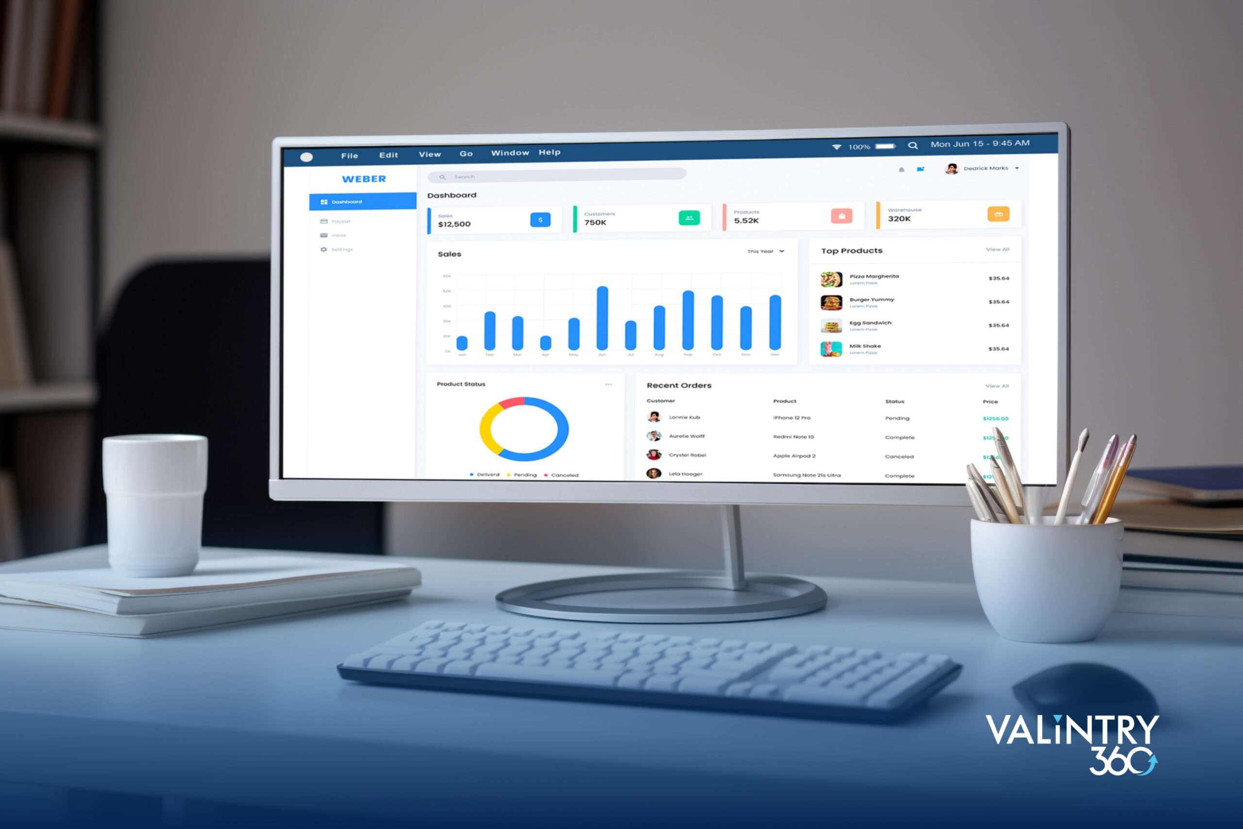
Salesforce Lightning Dashboards are an extremely powerful tool that can be used for a multitude of purposes to support your business initiatives, understand and visualize your data, and most importantly in my opinion – drive user adoption. Business Intelligence is extremely important to any business, it’s what allows managers and users alike to understand the pulse of the enterprise. It assists in the process of making key data-driven decisions and provides you with the unbiased (sometimes unwanted) truth. In this article, I’d like to go over some of my favorite dashboard components in Salesforce and explain why Lightning Dashboards are great user adoption tools.
1. Lightning Table
The Lightning Table is one of my absolute favorite dashboard components. The lightning table allows you to pull data from a report and display it in an easy to read and sortable format. This allows your end users to see quickly at a glance the information necessary to carry out their job duties. You can easily add and remove columns to provide as much or as little data to your teams as they require.
Some examples of what you can use this component for would be:
- Opportunity tracking: Give your sales team a live view of what stages their opportunities are in, assess what opportunities they should be focusing their time on to close, or gain insights on what opportunities should be closing over the next quarter.
- Activity reports: Track and monitor your teams’ performance in Salesforce, understand what tasks you’ve accomplished over the defined time period and what is still ahead, or view what accounts you’ve worked on the most this week/month/quarter.
- Oversee your teams’ support tickets: Use lightning tables to create manager dashboards for Support / IT Managers to oversee the activities and pending support items that their teams are working on. View in real time which tickets have been active the longest and know exactly when to step in for additional support.

2. The Funnel
I know what you’re thinking, why are these all opportunity based? Please follow me on this – the funnel is hands down the most well-received dashboard component on a rollout I’ve ever had. Sales people love it, managers love it, owners love it. A funnel is a true way to show the overview of any sales organization. It’s also an easily understood visual representing your sales process and sales pipeline. The best approach to displaying a funnel for sales opportunities is showing what is closest to closing at the bottom of the funnel and the new prospects at the top.
When you look at a funnel you can quickly tell if your sales team or your own personal book of business has enough value in it to hit your quotas. You can also assess improvement areas – if you do not have enough new business coming into the top of your funnel, maybe you need to focus time on prospecting. On the same note, if you have too much in the top of the funnel and not enough towards the bottom, you need to work on your appointment and meeting settings.

3. The Gauge Chart
There are so many great components that Salesforce offers for dashboarding, but I’ll close out my favorites list with The Gauge Chart. This chart is a great motivating tool to put on every end user dashboard to display goals and targets that come directly from record counts. It allows you to show the end users in real-time how close or far away they are from their goals. Does your organization have a target number of sales meetings per month? Do your support analysts have a required amount of tickets to complete per day? Or do you have a required number of new leads entered per day? No matter what your goal is, the gauge chart is a powerful tool to display progress against goals in real time.
The image of the gauge chart below displays the side panel that is available when editing the gauge panel. This is to show that you can adjust the numbers, sections, and distance from goals when you create this dashboard component.
Aside from these great dashboard tools and components you also have access to bar graphs, donut charts, scatter plots, stacked graphs, metric charts, line charts, and legacy tables. No matter your business intelligence or end-user needs you can tackle large challenges with proper dashboarding methodologies!

Dashboarding for End User Adoption
In summary, dashboards are an excellent tool for businesses of all shapes and sizes. If you are struggling with end-user adoption, usage, or process you should consider implementing a dashboard. It’s important to involve the users of the dashboard during every step of the process; they’re the ones using the tool after all. If you attempt to create the dashboards on your own, you may face resistance and could end up having to double up on efforts once they provide you feedback. If you involve your users in the process early on you can avoid these headaches.
Remember, creating dashboards is an iterative process. Work with your end users and help define their needs, create processes, and increase productivity.
Need help setting up your Lightning Dashboards and other elements of your Salesforce implementation? The experts at VALiNTRY360 can help! Contact us today to get a free quote!
Related Posts
- Uncategorized
Profile: Victor Adapts & Succeeds Remotely in 2020
Editor’s Note: This post is part of an ongoing series that looks into the lives of the VALiNTRY360 team and how they “walk the walk” when it comes to embodying Digital Transformation. When Victor took his first remote job before…
- Uncategorized
Team Member Profile: Vanessa Balances Work and Family…
Editor’s Note: This is the first in an ongoing series that looks into the lives of the VALiNTRY360 team and how they “walk the walk” when it comes to embodying Digital Transformation. Is it possible to eat 3 meals a…
- Uncategorized
INFOGRAPHIC: Get More Out of Your Salesforce CRM…
Salesforce is the #1 CRM in the world. But many don’t realize the importance of a correctly configured CRM and support team. From protecting sensitive data to massive ROI, your company will see major benefits just by optimizing and right-sizing…