Overview

Salesforce dashboards provide a single source of truth for making informed decisions with data. When working with diverse business data, static reports and spreadsheets are no longer enough. Salesforce dashboards transform complex data into visual displays using charts, graphs, and tables that help teams gain insights quickly. CRM Analytics in Salesforce offers live, interactive reports, turning your complex data into visual displays using charts, graphs, and tables that help teams gain insights quickly.
Creating performance-based dashboards doesn’t have to be complicated. If you’re new to Salesforce or want to improve your setup, this guide will help you make great dashboards. We’ll cover everything from basic setup to advanced design principles, with practical templates you can implement right away.
What is a Salesforce Dashboard?
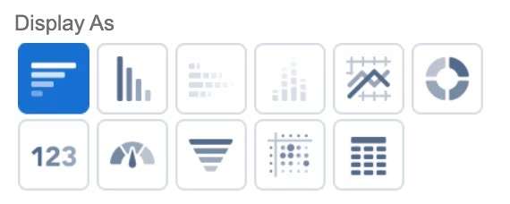
In Salesforce, a dashboard is a visual display of data from reports, designed to provide a high-level overview of key metrics and trends. It allows users to quickly understand the performance of their organization or team at a glance. Dashboards in Salesforce are composed of components, which can be various types of charts, tables, and metrics.
There are eleven different component types in total:
- Horizontal bar chart
- Vertical bar chart
- Stacked horizontal bar chart
- Stacked vertical bar chart
- Line chart
- Donut chart
- Metric chart
- Gauge chart
- Funnel chart
- Scatter chart
- Lightning table
With eleven different component types available, including bar charts, line charts, and donut charts, you can customize your visual representation to match exactly what your team needs.
Set Up Your Dashboard Environment
Before creating Salesforce dashboards, it’s essential to configure your Analytics Studio environment correctly. Launch Analytics Studio via the App Launcher to access analytics assets. Dashboards can also be embedded directly into Salesforce pages, enabling seamless integration for users.
Salesforce CRM Analytics involves three core components:
- Datasets: Optimized collections of data enabling rapid exploration.
- Lenses: Visualization tools for analyzing individual datasets.
- Dashboards: Interactive visualizations combining multiple widgets for comprehensive insights.
Assets are organized within Analytics Apps, grouping related analytics for teams or projects. Use the Dataset Recipe Builder to merge datasets easily. Additionally, the B2B Marketing Analytics App syncs Pardot and Salesforce data automatically, streamlining marketing insights.
For expert assistance, consider partnering with IInfotanks to optimize your Salesforce dashboard setup effectively.
How to build a Salesforce dashboard
To create a dashboard in Salesforce Analytics Studio (formerly CRM Analytics), Start by navigating to Analytics Studio and selecting “Create | Dashboard”. Choose a template or a blank dashboard to begin building your visualizations. Add components like charts and tables to display your data, selecting from a variety of chart types and customizing their appearance.
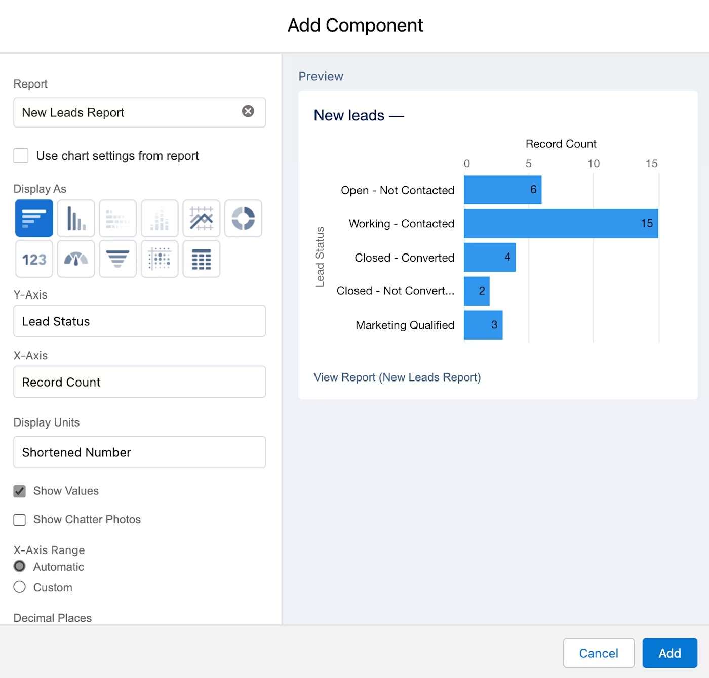
We’re here to guide you in creating dashboards in Salesforce. Together, we’ll build an example dashboard highlighting new leads and their current status. Experience clarity and control at your fingertips!
Detailed Steps:
1. Access Analytics Studio: Log in to your Salesforce org and navigate to Analytics Studio.
2.Create a Dashboard:
- Click “Create” in the top navigation.
- Select “Dashboard”
- Choose a template or start with a “Blank Dashboard”.
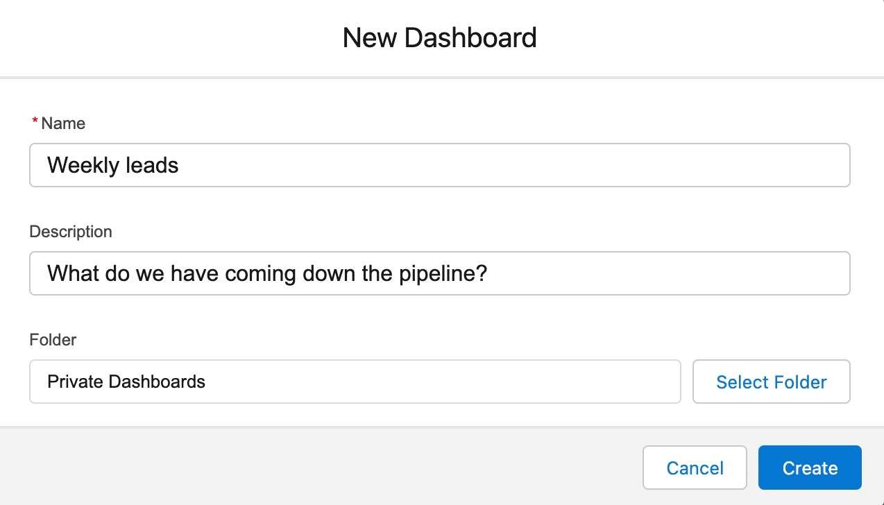
3. Build Your Dashboard:
- Add Components: Click “+” to add widgets (charts, tables, etc.) to your dashboard canvas.
- Choose Data: Select the dataset or report that you want to visualize.
- Customize: Adjust chart types, labels, colors, and other visual aspects to match your needs.
4. Save Your Dashboard: Give your dashboard a name and save it.
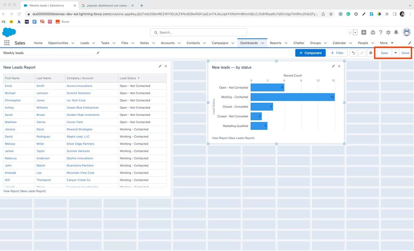
5. Share and Collaborate: You can share your dashboard with specific users or groups.
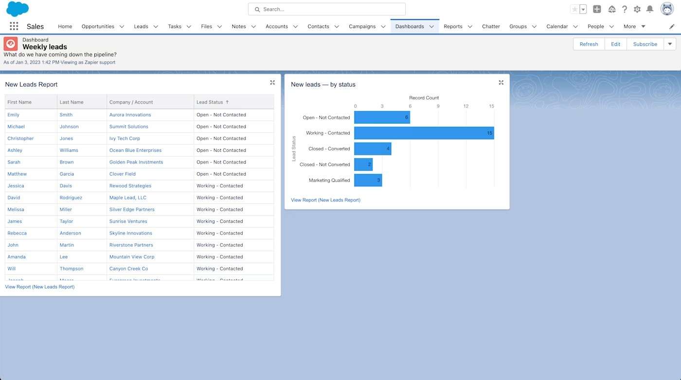
6. Explore Further:
- Dynamic Dashboards: Create dashboards that dynamically change based on user selections or data.
- Dashboard Pages: Add multiple pages to your dashboard to organize complex visualizations.
- Customization: Utilize the Advanced Editor to customize your dashboards further.
Need specialized assistance with dashboard design or sharing strategies? IInfotanks offers expert consultancy services to help optimize your Salesforce dashboard implementation for maximum business impact across your organization.
Conclusion
Salesforce dashboards help transform complex business data into clear, actionable insights. Throughout this guide, you’ve learned the essentials from setting up your dashboard environment and creating impactful visualizations to making strategic decisions informed by your data. If dashboard implementation feels challenging, partnering with experts like IInfotanks can simplify the process. Our Salesforce consultancy guarantees your dashboards are practical, easy to use, and integrated seamlessly. Start with the fundamental metrics your business values most, expand gradually, and let each new dashboard energize your team to turn data-informed observations into practical results.
Related Posts
- Agentforce
- Change Leadership
- Digital Transformation
- Salesforce Consulting Services
- Salesforce CRM
- Salesforce Data Cloud
- Salesforce Development Services
- Salesforce Implementation Services
- Salesforce Integration services
- Salesforce Managed Services
Salesforce Headless 360: The Leader’s Guide to Headless…
IN SHORT Salesforce Headless 360 exposes your entire platform, including CRM, Agentforce, Data Cloud, and Slack, as APIs, MCP tools, and CLI commands. Instead of logging into a browser, AI agents built using headless code access data, trigger workflows, and…
Top Salesforce Consulting Firms and Implementation Partners in…
INTRODUCTION There are over 2,300 Salesforce consulting firms listed on AppExchange in the United States alone. The Salesforce partner ecosystem is projected to be nearly six times the size of Salesforce itself by 2026, with partners collectively earning $6.19 for…
How Much Does Pardot Implementation Cost?
INTRODUCTION Pardot Costs More Than the License. Start There.The license price for Pardot (now officially called Marketing Cloud Account Engagement) starts at $1,250 per month. That number appears on Salesforce's pricing page, and it is the number most B2B marketing…

